Whether you're using Vyssuals, Excel, Power BI, or any other data visualization tool, understanding the fundamentals of chart configuration is essential for creating clear, meaningful visualizations. This guide will walk you through the core concepts using bar charts as our primary example.
Understanding Chart Structure
Every chart has two fundamental components that determine how your data is displayed:
The X-Axis (Horizontal)
The X-axis represents the categories or groups you want to compare. Think of it as "what are we looking at?"
Examples:
- Building types (Office, Residential, Industrial)
- Room categories (Living Room, Kitchen, Bedroom)
- Material types (Concrete, Steel, Wood)
- Time periods (Q1, Q2, Q3, Q4)
The Y-Axis (Vertical)
The Y-axis represents the values or measurements you want to compare. Think of it as "how much of it do we have?"
Examples:
- Counts (number of elements)
- Areas (square footage)
- Quantities (volume, weight)
- Percentages
- Costs
Choosing the Right Parameters
For the X-Axis: Categorical vs. Numerical Data
Categorical Data (Text/Names)
Use categorical data on the X-axis when you want to compare distinct groups or types.
Good examples:
- Element categories (Walls, Doors, Windows)
- Room names (Kitchen, Living Room, Bedroom)
- Material types (Concrete, Steel, Wood)
- Status values (Complete, In Progress, Pending)
Why it works: Each category is distinct and doesn't have a natural numerical order.
Numerical Data (Numbers with Meaning)
Use numerical data on the X-axis when the values have inherent meaning and order.
Good examples:
- Room area ranges (0-10m², 10-20m², 20-50m², 50m²+)
- Height ranges (0-3m, 3-6m, 6-9m, 9m+)
- Performance scores (1-5, 6-10, 11-15, 16-20)
- Cost ranges ($0-$1000, $1001-$5000, $5001-$10000, $10000+)
Why it works: The numerical order provides context and shows progression.
For the Y-Axis: Aggregation Methods
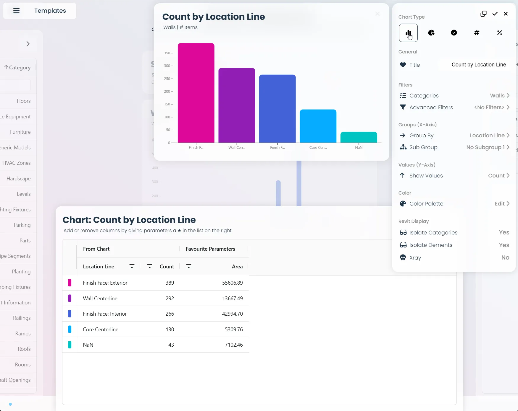
Count-Based (Element Counts)
Use when you want to know "how many" of each category.
Example: Number of doors by door type
- X-axis: Door Type (Single, Double, Sliding)
- Y-axis: Count of doors
Best for: Understanding distribution and identifying the most/least common types.
Sum-Based (Total Values)
Use when you want to know "how much total" of each category.
Example: Total area by room type
- X-axis: Room Type (Kitchen, Living Room, Bedroom)
- Y-axis: Sum of room areas
Best for: Understanding total impact or resource allocation.
Color Configuration: Palette vs. Gradient
Color Palette Mode (Categorical Colors)
When to use: X-axis contains categorical data (text/names)
How it works: Each category gets a distinct color from a predefined palette.
Example:
- Red: Office buildings
- Blue: Residential buildings
- Green: Industrial buildings
- Purple: Mixed-use buildings
Benefits:
- Easy to distinguish between categories
- Intuitive for categorical comparisons
Best practices:
- Use colors that are visually distinct
- Keep the palette consistent across related charts
Gradient Color Mode (Sequential Colors)
When to use: X-axis contains numerical data with inherent order
How it works: Colors transition smoothly from light to dark based on the numerical value.
Example:
- Light blue: Small rooms (12.5m², 15.2m², 18.7m²)
- Medium blue: Medium rooms (22.1m², 28.9m², 35.4m²)
- Dark blue: Large rooms (42.8m², 56.3m², 78.9m²)
Benefits:
- Shows progression and magnitude
- Intuitive understanding of "more vs. less"
- Creates visual hierarchy
Best practices:
- Use light-to-dark progression for positive values
- Consider using diverging colors for data that can be negative
- Ensure sufficient contrast between adjacent colors
When to Use Categorical vs. Gradient Colors with Numerical X-Axis
Sometimes you'll have numerical data on the X-axis, but the choice between categorical colors and gradient colors depends on what you're trying to communicate.
Use Gradient Colors When: The Numerical Order Matters
Example: Room Area Analysis
- X-axis: Individual room areas (12.5m², 15.2m², 18.7m², 22.1m², 28.9m², 35.4m², 42.8m², 56.3m², 78.9m²)
- Y-axis: Count of rooms
- Color: Gradient (light to dark blue)
Why gradient works here: The progression from small to large rooms shows a natural scale. Light blue for small rooms and dark blue for large rooms intuitively communicates "more area = darker color." You can easily identify the smallest room (12.5m²) and largest room (78.9m²).
Best for: Understanding distribution patterns, identifying size clusters, and seeing trends across the numerical spectrum.
Use Categorical Colors When: The Numerical Values Represent Discrete Categories
Example: Long Building on Light Slope - Core-Based Offset from Level
- X-axis: Individual offset values (0.2cm, 0.5cm, 1.2cm, 2.8cm, 5.1cm, 8.7cm, 12.3cm, 15.8cm)
- Y-axis: Count of elements
- Color: Categorical palette (red, orange, yellow, green)
Why categorical works here: In a long building on a gentle slope, you have multiple cores (entrance points) at different heights along the building. Each core maintains its own offset from level, and all floors around that core use the same offset to match the entrance height. Red for cores with large offsets (significant height changes), orange for medium offsets (moderate adjustments), yellow for smaller offsets (minor adjustments), and green for minimal offsets (almost level). This creates immediate visual understanding of which core each element belongs to and how much that section of the building follows the terrain slope.
Best for: When numerical values represent discrete categories or groups rather than continuous progression, quality assessments, compliance checking, and situations where you need to distinguish between distinct numerical categories.
Decision Framework
Ask yourself:
"Does the order matter?" → Use gradient
- Room sizes, heights, costs, performance scores
- You want to see progression and trends
"Are these distinct categories?" → Use categorical
- Quality levels, risk assessments, compliance ranges
- You want to see clear separation between groups
Advanced Configuration Options
Grouping and Subdivision
Single-Level Grouping
Group your data by one parameter to create simple comparisons.
Example: Count of walls by wall type
- X-axis: Wall Type
- Y-axis: Count
Multi-Level Grouping
Group by multiple parameters to create more detailed analysis.
Example: Count of walls by wall type and level
- X-axis: Wall Type (with level subdivisions)
- Y-axis: Count
Benefits: Shows relationships between multiple parameters Consideration: Can become complex and harder to read
Filtering and Selection
Pre-Chart Filtering
Apply filters before creating the chart to focus on relevant data.
Examples:
- Only show elements on specific levels
- Only include elements with certain materials
- Exclude elements below a certain size
Interactive Filtering
Allow users to filter the chart after it's created.
Benefits:
- Users can explore different aspects of the data
- Maintains context while changing focus
- Enables self-service analysis
Best Practices Summary
1. Start Simple
- Begin with one parameter on each axis
- Use the most basic chart type that fits your data
- Add complexity gradually
2. Match Your Data Type
- Categorical data → Color palette
- Numerical ranges → Gradient colors
- Counts → Use count aggregation
- Totals → Use sum aggregation
3. Consider Your Audience
- What questions are they trying to answer?
- What's their technical background?
- How will they use this information?
4. Test and Iterate
- Create your chart
- Ask yourself: "Does this answer the question?"
- Adjust parameters and try different configurations
- Get feedback from others
Real-World Example: Building Analysis
Let's walk through a complete example of configuring a chart for building analysis:
Question: "How does the total area vary by building type and construction status?"
Step 1: Choose X-Axis Parameter
- Building Type (categorical) - good choice for X-axis
- Construction Status (categorical) - can be used for grouping
Step 2: Choose Y-Axis Parameter
- Total Area (numerical) - good choice for Y-axis
- Aggregation: Sum (we want total area, not average)
Step 3: Choose Color Mode
- Building Type is categorical → Use color palette
- Each building type gets a distinct color
Step 4: Configure Grouping
- Primary group: Building Type
- Secondary group: Construction Status
Result: A clear visualization showing how total area is distributed across building types and construction phases.
Conclusion
Chart configuration is both an art and a science. The key is understanding your data types and choosing the right parameters for your specific question. Remember:
- X-axis = What are we looking at?
- Y-axis = How much of it do we have?
- Colors = Palette for categories, gradient for numbers
- Start simple and add complexity as needed
Whether you're using Vyssuals, Excel, PowerBI, or any other tool, these principles will help you create more effective, meaningful visualizations that truly communicate your data's story.
This guide covers the fundamentals of chart configuration. For Vyssuals-specific features and workflows, check out our Getting Started Guide and other blog articles.